TARTINE
UX/UI Case Study
THE PROJECT
As part of my UX/UI course at Coursera by the California Institute of the Arts, I was tasked with completing a project.
The prompt was to create an app for a delivery only restaurant, that offered customized food only in a specific area of the city. I created Tartine, a French restaurant mobile app.
My role: Sole UX/UI designer
Duration: 3 weeks
Tools: Figma.
CONTEXT
Tartine is a customized sandwich restaurant that operates as delivery only, inspired in French cuisine. It delivers only in a specific area of the city. The idea is that people can have a taste of French style food in a simple and affordable way. Ideal for busy working people who can order from the comfort of their homes or workplaces, and have it delivered quickly for a tasty and different type of meal.
RESEARCH
COMPETITOR ANALYSES
I analyzed two similar French restaurants, and found out that neither of them would offer the option to customize their food according to their own taste. Instead, if people would want to try something French, they could only do this by going to an actual restaurant and ordering something from the menu.
SURVEYS AND INTERVIEWS
With the goal of understanding what locals would have for lunch while they are busy working, I made surveys to local people and interviewed some friends. Through my research, I could understand more about the needs of my users. I gathered this information and obtained some key findings and insight that helped me keep developing my app.
KEY FINDINGS
Users need an easy way to access French style food in an easy and affordable way, and a guaranteed fast delivery time.
Considering the increasing demand of convenience, I wanted the app to offer a quick and intuitive ordering process, to save users time and effort. I tried my app to have the least steps as possible, to increase the probabilities that customers would choose our restaurant over others.
DEFINE
I developed three user personas taking into consideration the feedback I received during my research, which helped me paint a clear picture of users’ needs and frustrations, and to maintain a user-centric focus during the process.

Scott
Age: 33
Occupation: Marketing specialist
Status: Single
“I try to always take a lunch break to help my productivity”
Scott works full-time at a multinational company. He works from home 3 days a week and orders food for lunch as he has a busy schedule. Scott loves sports and eating out with friends.
NEEDS
Order at least one day ahead if needed
Wants a new place to order food from to impress his colleagues
PAIN POINTS
Some orders take long to be delivered
Need healthier options
Want to schedule orders days in advance

Mike
Age: 28
Occupation: Graphic designer
Status: Married
“I love eating food from different countries and cultures”
Mike is a freelancer.
Works from a co-work office.
He loves having lunch at the office with his office mates.
“I love eating food from different countries and cultures”.
NEEDS
The option of ordering as guest without having to create an account
Wants diversity of food restaurants to order from
Would like the app to provide recommendations on what to order
PAIN POINTS
Long ordering processes
Most apps ask for users to create an account

Pam
Age: 32
Occupation: Legal Counsel
Status: Single
“I want to find a restaurant that can make me feel as if I were in France”
Pam is French and lives in South Melbourne.
She works at the office everyday.
She is very friendly and loves spending time with her coworkers.
Pam has been in a relationship for 5 years.
NEEDS
Would like somewhere to order real French ingredients
Order French food with a fast service
Have the option of customizing her order
PAIN POINTS
Want more French style food options in her area
Fast food is the fastest way to get food
Access French food in an affordable way
SITEMAP
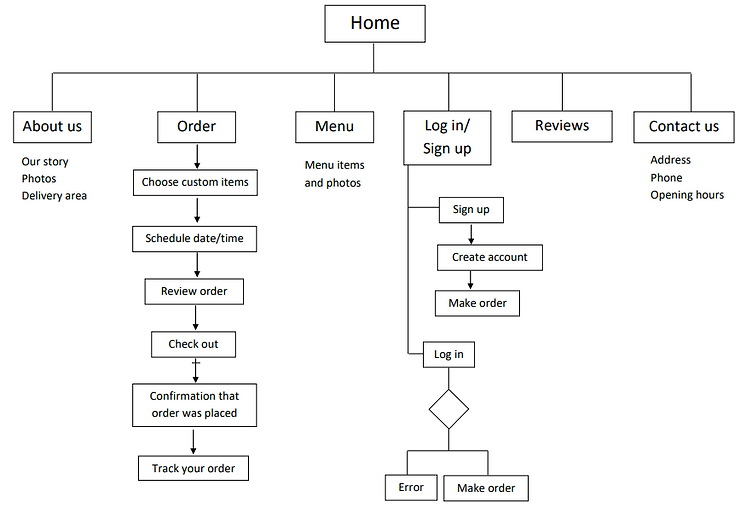
I created the following sitemap to organize the structure of my app and have a visual representation of the screens. This is what I consider is the best way the app would be organized.
IDEATE
LOW FIDELITY WIREFRAMES
As one of the main aims of Tartine is to have a quick and intuitive ordering process, as well as simplicity and ease of use, I tried to keep the number of screens to a minimum.


TEST
USABILITY TESTS
By conducting usability tests, I was able to refine what users were finding useful, and change what they didn’t react well to. The users were asked to complete a few tasks that would test the main features of the app, and were asked how they felt about the app in general.
KEY FINDINGS
I made notes of the positive and negative feedback so I knew which areas to keep expanding upon and what needed to be reworked
POSITIVE
Users liked to have a visual/photo of the ingredients.
They found the ordering process quite simple and with few steps.
NEGATIVE
The menu button needs to be more clear.
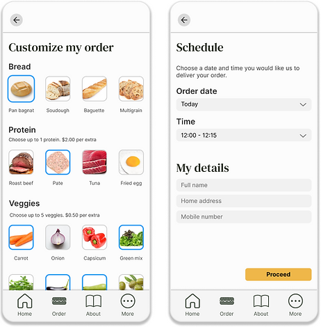
Add what the base price for any sandwich is. And if the user wants to add any extra ingredient, they need to pay more per each.
Add next to evert step of the ordering process how many ingredients you can add, that are included in the base price.
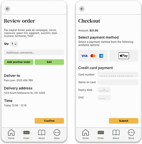
Add the option to “continue ordering”.
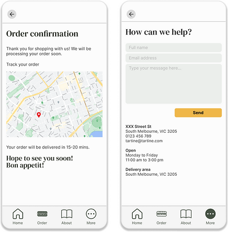
Add the option to track the order to see where the delivery is coming.
Instead of adding “sandwich inspiration”, add some sandwich suggestions, in case they don´t know what ingredients to choose.
ITERATE
DESIGN CHANGES
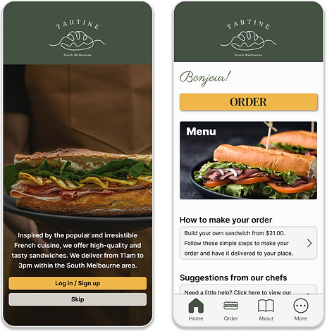
The feedback received was crucial to make the changes accordingly. I proceeded to create high fidelity mockups, taking into consideration the comments received.
I also added the option to edit, go back, and review the order in every step.
FINAL PRODUCT
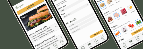
I used real images to engage users and give them a visual idea of what they were ordering. The design is visually appearing and easy to use, and includes a simple ordering process with few steps.
